What is the most essential function of your restaurant’s website design? It is certainly not the aesthetics. It is not even, what the diners can learn about you through it. At the end of the day, your restaurant’s website is all about driving direct orders.
What you want is potential diners browsing your website to complete the ordering process, turn up at the restaurant and order a meal. In order to accomplish this, your website must have a design that is not just appealing, but high converting.
Whilst the aesthetics and content of your website are of high importance, they are just the tools you are using to drive conversions. It is vital to ensure they are orientated to make the diners take the steps you want them to take- direct orders. With all that being said, here are 4 design tactics helping restaurateurs drive direct orders.
Choose Between Responsive or Adaptive Design

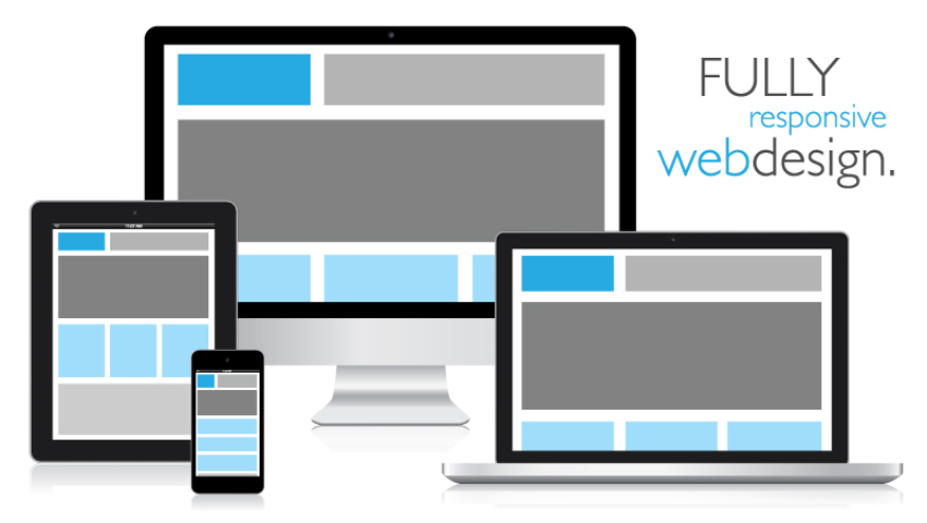
People have become more comfortable making restaurant orders online and as a result sales from mobile devices have soared. Your restaurant website needs to be either responsive or adaptive. Making your website easy to navigate on all devices boosts your conversions because your diners can research and order from you with no difficulty.
You may be wondering what the difference is between a responsive and adaptive website and the answer, responsive sites flow from one size screen to another. They hide elements and change layouts as needed for different devices.
Adaptive websites use static layouts based on ‘breakpoints’ for different screens. For example, you may have one version of your website for large screens such as desktops or laptops, one for tablet and one for mobile. It is not uncommon to create 3-6 different widths of your website. Each have advantages and disadvantages, I recommend you research to make the right choice for your restaurant.
Simplify Navigation

Simple navigation is essential to the diner’s journey. If they cannot locate what they are looking for on your website, your ’virtual restaurant’ will not do the job that it is meant to.
The initial thing to keep in mind when you are looking at your restaurant’s website’s navigation is this: navigation is a means to an end. The end goal is for users to see your content.
Smashing Magazine says, “while content is supposed to be unique, surprising and exciting, navigating to it is supposed to be as simple and predictable as possible”. In other words, there are plenty of other areas to show your creativity and navigation is not one of them.
Before you begin, ensure you are looking at it from the user’s perspective. The goal is to make your website absolutely simple and straightforward for your diners.
Use Directional Cues

We generally follow subconscious vital cues presented to us. Numerous case studies have proven that visual cues, similar to arrows, lines, tunnel effects and even the direction a person is looking in are great for drawing attention to specific elements on your website.
Directional cues are a strong and effective way to draw more attention to your call to action, your content, navigation bar or testimonials.
Make Your Call to Action Stand Out

Your call to action is one of the most vital aspects in driving your bookings. How visible is it? How colourful? What text does it have in it? These factors can ultimately spike or reduce conversions.
It is essential to make it as strong and prominent as possible on the page. In order to ensure your call to action attracts attention:
- Use a colour that stands out. It must contrast with the other colours on your page.
- Make your button look clickable. Give it a distinctive shape and have enough space around it for it to stand out.
- Ensure it is a sensible size.
- Don’t use vague copy, invite your diners to take action.
Conclusion
To increase restaurant bookings and online orders, design is essential. Your design must be simple, allow for swift navigation and communicate the right message to the right potential diners. Get ready to be swimming in direct orders.


